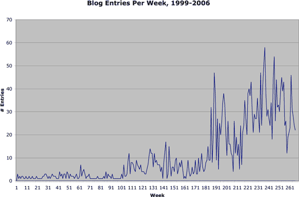
Blog entries I’ve written, per week, since 1999. Excluding sideblog entries.
Click to embiggen.
Open source, procurement, and gov tech.
Blog entries I’ve written, per week, since 1999. Excluding sideblog entries.
Click to embiggen.
Comments are closed.
It got near sixty there at one point.
It seems like with that much typing, you ought to get paid.
If not for all the good ideas, for the physical therapy your fingers and wrists will need after it’s all said and done…
:)
Can you transpose that with two other graphs? One for unique IP addresses that visit the site each week, and one for number of legitimate comments posted each week… that way you can correlate your own writing to reading and/or instigation of comments… or prove they are unrelated…
This, and other time consuming hobbies, brought to you by the letter G and the number 4.
Keep up the excellent work, please! You are the first blog and news site I read every day.
Since I moved to a shared host last year, my log files are now rotated out every month, rather than kept forever, so I no longer have a detailed record of individual site visits. But the number of comments would be an interesting graph, particularly when juxtaposed with the number of blog entries.
Thanks for the great idea!