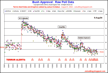
 At left is a chart overlaying a history of Bush’s approval ratings (using a scatterplot of all of the major polls) with his issuance of terror alerts, based on this raw data. (Reading through that data will be quite helpful in fully understanding the correlation, if not causation, between the two datasets.) Writes Julius Civitatus, who aggregated this data:
There are few things that are quite evident from the chart:
- Whenever his ratings dip, there’s a new terror alert.
- Every terror alert is followed by a slight uptick of Bush approval ratings.
- Whenever there are many unfavorable headlines, there’s another alert or announcement (distraction effect).
- As we approach the 2004 elections, the number and frequency of terror alerts keeps growing, to the point that they collapse in the graphic. At the same time, Bush ratings are lower than ever.
These data certainly present compelling evidence that the Bush White House may be using terror alerts (which is to say, creating terror) for political gain.